Custom Weather Widget for iPhone: Create Your Perfect Home Screen
Apple's weather widget lets you change one thing: the city. Everything else — style, layout, clock, size, background, what data appears — needs a widget built to be customized. Here is every type worth knowing, what each one is actually good for, and how to set it up in a couple of taps.
Custom weather widgets
A custom weather widget is one where you decide three things: what it shows, how it looks and where it lives. That sounds obvious until you try it with the built-in widget, which only exposes location. Everything interesting — layout, theme, which values appear, how the background reacts to conditions — comes from apps designed around customization.
Start from the question you ask your phone most often. "Do I need a jacket" needs one number and a condition icon. "Will the game get rained out" needs an hourly strip and a rain probability. A custom widget is worth setting up precisely because those two people should not have the same Home Screen.
Weather + clock widgets
The most requested combination on iPhone, and the one iOS does not offer natively. A weather-and-clock widget answers "what time is it and what is it doing outside" in a single glance — which is exactly what you want at the top of a Home Screen page, above the app icons.
Two ways to get it. The clean one is an app whose medium widget includes the time alongside conditions. The pragmatic one is placing a clock widget immediately next to a small weather widget: with matching tones, the pair reads as one block.
- Medium size — best fit: room for time, temperature and condition without shrinking anything.
- Keep it to three values — time, temperature, condition. Adding humidity turns it into a table.
- Top row of the Home Screen — it is the first thing your eye lands on when you unlock.
Animated weather widgets
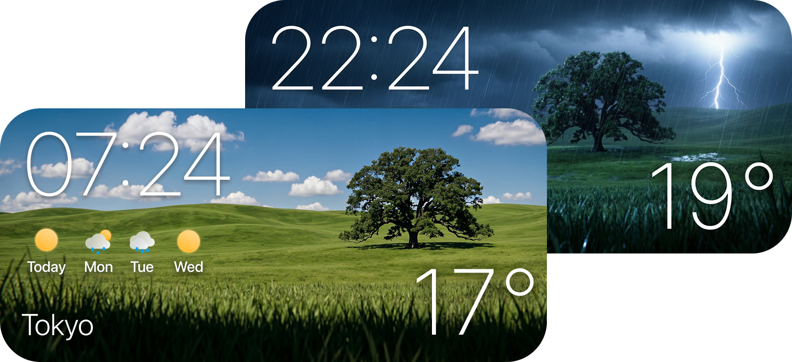
Worth being precise here, because it is the single biggest misconception about iPhone widgets: iOS does not run continuous animation inside a widget. Widgets are rendered as a timeline of states and refreshed on a battery budget, so no app can legitimately promise falling rain playing on your Home Screen all day.
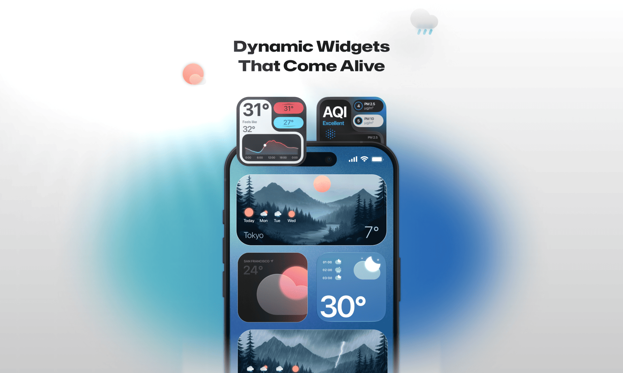
What is genuinely possible — and what people mean when they search for an animated widget — is artwork that changes: rain visuals when a front moves in, night tones after sunset, a different sky when the sun is out. It feels alive because it is never the same twice in a day, without burning battery pretending to be a video.
Large weather widgets
The large size is the only one with room for two layers of information: what is happening in the next few hours, and what the rest of the week looks like. It is the right choice if you actually plan around the forecast — cycling, outdoor work, weekends away.
It is the wrong choice if you use it as a dashboard. A large widget filled with twelve values is harder to read than a small one with two, because nothing is dominant. Keep one hierarchy: hourly strip first, multi-day underneath, everything else in the app.
- Use it for — hourly plus multi-day in a single glance.
- Avoid — cramming radar, air quality, sunrise, wind and UV into one panel.
- Placement — its own page, or the top of the first page. It costs four icon slots, so make it earn them.
Minimal weather widgets
A minimal widget shows one thing large: temperature, or the next precipitation. Nothing else. It suits people whose Home Screen is deliberately quiet, and it is far more readable in bright sunlight than any multi-value layout.
The trick with minimal is choosing the right single value. Temperature is the default, but "rain in 40 min" is a better one if you commute by bike or walk to work — a number that changes a decision beats a number you merely note.
Aesthetic weather widgets
"Aesthetic" is not a style, it is a fit: the widget belongs to your wallpaper instead of sitting on top of it. Three rules get you there faster than downloading five apps.
- One medium widget beats three small ones. More space per value means bigger type and calmer composition.
- Match the tint to the wallpaper behind it. iOS has no true transparency, so apps approximate it — pick the tone closest to the area the widget covers.
- Leave air around it. An empty icon row above a widget is what makes it look designed rather than wedged in.
Then stop. The reason most "aesthetic Home Screen" attempts fail is the sixth addition, not the first.
Lock Screen weather widgets
Lock Screen widgets are the most used and least considered. They are small, they sit above or below the clock, and you see them dozens of times a day without unlocking — which makes them the best place for the single most urgent piece of information, not a summary of the day.
Give the Lock Screen "right now, or what is about to happen": current condition, or next precipitation. Leave the day's shape to the Home Screen. Two surfaces, two jobs, no duplication.
Weather widgets with dynamic backgrounds
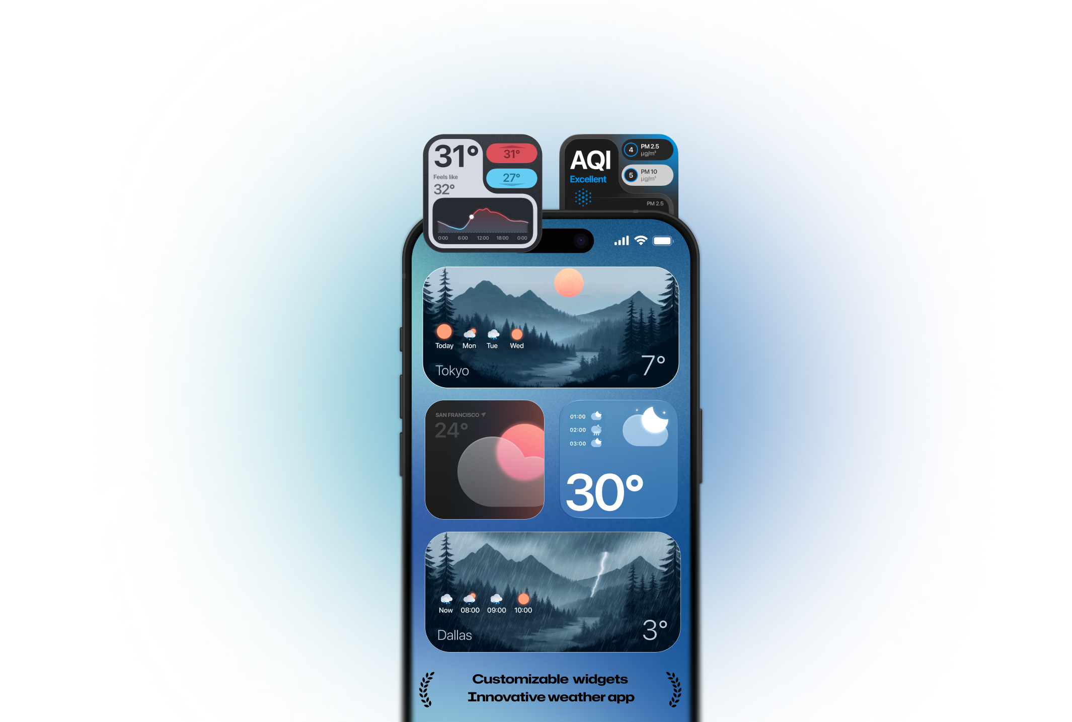
This is the most useful customization on the list and the least understood. A dynamic background means the widget's own artwork carries information: you know it is going to rain before you read the word "rain", because the panel already looks like rain.
Done well, it works on two axes at once — conditions (clear, cloudy, rain, storm, snow) and time of day (dawn, day, dusk, night). The result is a widget that never looks identical two glances in a row, and a Home Screen that quietly tells you the weather changed while you were not looking.
Done badly, it is a photo behind white text that becomes unreadable at noon. The test is simple: can you still read the temperature with the brightest and the darkest background variants?
How to customize any weather widget in four taps
- Add it — touch and hold an empty area of the Home Screen, tap +, search the app, pick a size, tap Add Widget.
- Edit it — touch and hold the placed widget, tap Edit Widget.
- Configure it — location (current or pinned), units, then style or theme.
- Stack it — drag a second widget onto it to build a Smart Stack you can swipe through.
The complete walkthrough, including Today View and troubleshooting, is in our guide to weather widgets for iPhone. If you are still choosing an app, start with our comparison of the best weather widgets for iPhone.
Frequently asked questions
Apple's widget only lets you change the location. For style, layout, colours or which data appears you need a third-party widget: touch and hold it, tap Edit Widget, and pick from the options the app exposes.
iOS has no built-in combo. Use an app whose medium widget includes the time, or place a clock widget directly beside a small weather widget so the two read as one block.
Not frame-by-frame. iOS renders widgets as static timelines to protect battery. What is possible is artwork that changes with conditions and time of day, which is what most people are after.
True transparency is not available on iOS. Apps fake it with tinted or blurred backgrounds — choose the tint closest to the wallpaper area behind the widget.
Medium. It holds an hourly strip without shrinking the type. Large only if you really read the multi-day forecast; small for a single value.
Create your own weather widget with Weather Widget Magic
Pick a style, a size and a location, and let the widget change with the sky: dynamic backgrounds for every condition and hour, live radar, and rain and hail alerts up to an hour ahead. Free on the App Store.
Download on the App StoreDownload on the App Store